Erlang C Staffing Planner — user guide
Calculate how many agents each interval needs, compare it to what you have rostered, and see where the day is short.
This guide takes about fifteen minutes end to end. The one step worth not skipping is Average handle time — it is the only field that will silently give you wrong answers if you get it wrong.
What you need
| Power BI Desktop | Current version |
| Interval data | One row per interval, with contact volume and handle time |
| Roster data | Optional. Agents scheduled per interval |
Interval data usually comes out of the ACD or WFM platform — Five9, Genesys, NICE, Talkdesk, Amazon Connect, Cisco and similar all export it. Any grain works as long as it is consistent: 15, 30 or 60 minutes.
Step 1: Add the visual
If you bought the visual from Microsoft AppSource, there is no file to download. It installs from inside Power BI.
- In Power BI Desktop, open the Visualizations pane.
- Click the ⋯ at the bottom of the icon list.
- Choose Get more visuals.
- Search for Erlang C Staffing Planner and click Add.
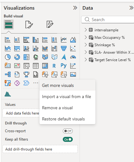
The icon then appears in the Visualizations pane and stays there for new reports. Updates arrive automatically.
If your organisation deploys visuals centrally
Some tenants block AppSource and have an administrator publish approved visuals instead. If Get more visuals shows an Organizational tab, or shows nothing at all, ask whoever administers Power BI in your organisation to add it.
Licences
Buying through AppSource gives you licences to assign, not a key to enter. Assign them per user in the Microsoft 365 admin center. After a licence is assigned it can take up to an hour to be recognised – refresh the browser, or restart Desktop.
Without a licence the visual still runs in evaluation mode, which calculates your own data with your own parameters over a limited number of intervals. See evaluation mode for what is and is not included.
Step 2: Load your data
Your table needs, at minimum:
| Column | Example | Notes |
|---|---|---|
| Interval start | 2026-03-02 09:30 |
Date/time. The start of the interval |
| Contacts | 210 |
Contacts offered in that interval |
| Handle seconds | 66394 |
Total seconds, not an average — see step 3 |
| Queue | Billing |
Optional |
| Scheduled agents | 67 |
Optional |
If your source gives you an average handle time rather than a total, that is fine — step 3 covers both.
Check the interval column
The visual identifies each interval by its timestamp, so the field you map to
Interval has to tell two days apart. A Date/Time column does that on its
own and is the simplest thing to use.
Power BI sometimes reads a timestamp as text instead. In the Data view,
select the interval column and check the type in Column tools. If it says
Text, use Transform data and set it to Date/Time.
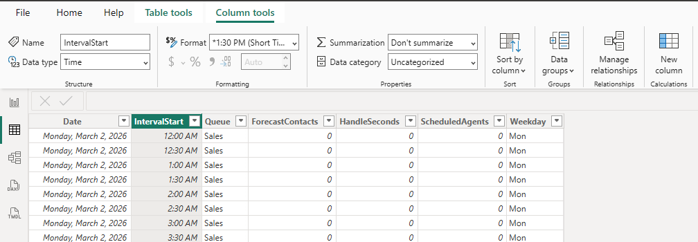
If your model splits the date and the time into separate columns, that works too, as long as the field you map still separates one day from the next. What does not work is mapping a bare time-of-day with the date discarded: every Monday 09:00 then keys to the same interval as every Tuesday 09:00, and a week silently folds into a single day.
The check takes five seconds. Hover any interval and read Queues in the tooltip. It should equal the number of queues you actually have. If you run three queues over five days and it says 15, your days have folded together.
Step 3: The one measure you must build
Average handle time cannot be a plain column. This is the single most common way to get a confidently wrong answer out of this visual.
Dropping a column called AHT into the field well makes Power BI average it —
and an average of averages is not the average.
One interval handles 500 contacts at 200 seconds. The next handles 5 contacts at 900 seconds. The true weighted average is 207 seconds. Averaging the two averages gives 550. Offered load comes out nearly three times too high, and the visual will confidently recommend staffing for it.
Nothing will warn you. The chart looks entirely normal either way, so this is one to check yourself rather than wait to be told about.
If your data has total handle seconds
Right-click your table → New measure:
Weighted AHT =
DIVIDE(
    SUM( Interactions[HandleSeconds] ),
    SUM( Interactions[Contacts] )
)
DIVIDE rather than / so an interval with no contacts returns blank instead
of an error.
If your data only has an average per interval
Reconstruct the total first, then divide:
Weighted AHT =
DIVIDE(
    SUMX( Interactions, Interactions[AvgHandleTime] * Interactions[Contacts] ),
    SUM( Interactions[Contacts] )
)

The screenshot is from the sample model, so the names differ from the examples
above — the measure is WeightedHandleTime over a table called
intervalsample. Call yours whatever suits your model; only the shape of the
calculation matters.
Check it worked
Put Weighted AHT in a card visual with no filters. It should look like a
plausible handle time for your operation — a few hundred seconds for voice. If
it comes out in the thousands, the measure is summing rather than averaging.
Step 4: Add the visual and map the fields
Drop the visual on the canvas and fill the field wells:
| Field well | Drop in | Required |
|---|---|---|
| Interval | Your interval start column | Yes |
| Forecast contacts | Contacts (Sum) | Yes |
| Average handle time (seconds) | Weighted AHT |
Yes |
| Scheduled agents | Scheduled (Sum) | No |
| Queue or group | Queue | No |
Until the first three are filled the visual tells you which one is still missing rather than drawing anything.
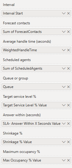
The screenshot shows nine wells because it also has the four what-if overrides from step 6 mapped. Only the five above matter for now.
The date hierarchy trap
Power BI creates an automatic date hierarchy and will drop your interval column in as Date Hierarchy — which throws away the time and collapses a week of half-hours into seven points.
Click the dropdown on the field chip in the well and pick the plain field name instead:
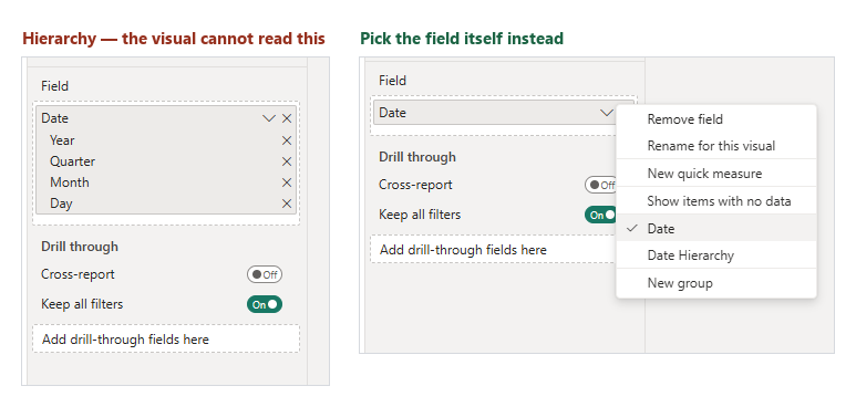
On the left is the broken state — if your well looks like that, the visual is being handed a hierarchy rather than timestamps. On the right is the fix.
To turn it off everywhere: File → Options and settings → Options → Data Load → Auto date/time, unchecked.
Step 5: Set your staffing parameters
Open the Format pane. Under Staffing parameters:
Service level (SLA) — the two halves of your service target:
| Setting | Default | Means |
|---|---|---|
| Answer this share of contacts | 80% | The percentage half |
| Within this many seconds | 20s | The time half |
Together: “80% answered within 20 seconds.”
Staffing and intervals:
| Setting | Default | Means |
|---|---|---|
| Shrinkage | 30% | Paid time not available for contacts: breaks, training, absence, meetings |
| Maximum occupancy | 85% | Ceiling on the share of productive time spent handling contacts |
| Interval length | 30 minutes | Must match your data’s grain |
Set interval length to match your data
If your rows are 15 minutes apart, set 15. If they are hourly, set 60. This is not detected automatically, and it is not a preference — it tells the calculation how long each interval lasts.
Get it wrong and every number on the chart is wrong, with nothing to indicate it. Staffing for a 30-minute interval labelled as 15 comes out roughly half what you need. It is worth checking before you trust the first chart you draw.
About maximum occupancy
Occupancy is the share of an agent’s productive time spent actually handling contacts. Sustained occupancy above roughly 85% is a well-documented driver of burnout and attrition, so this setting is a ceiling, not a target — staffing is raised until occupancy falls below it.
This is usually why the numbers differ from an online Erlang calculator. Many of those solve only for service level and will happily return an answer implying 90%+ occupancy. This one adds agents until occupancy is under your ceiling, even when service level was already met. If you want to compare like for like, raise the ceiling and the answers converge.
Step 6: Let report readers change the parameters
The Format pane is author-only. Someone reading your published report cannot open it — so out of the box they cannot ask “what if shrinkage were 35%?”, which is often the whole reason they opened the report.
Four optional field wells fix that. Bind a what-if parameter to one and the reader gets a slicer.
Creating a what-if parameter
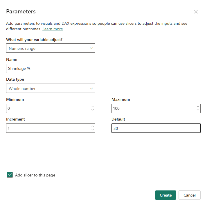
- Modeling tab → New parameter → Numeric range.
-
Fill it in. For shrinkage:
Name Shrinkage %Data type Whole number Minimum 0Maximum 100Increment 1Default 30 - Leave Add slicer to this page ticked.
- Click Create.
- Drag the measure Power BI just created —
Shrinkage % Value, not the column — into the visual’s Shrinkage % field well.
Step 5 is the one people get wrong, because Power BI creates three objects and they sit together under the same name:
| What | Named | Use it? |
|---|---|---|
| A table | Shrinkage % |
No |
| A column inside it | Shrinkage % |
No |
| A measure | Shrinkage % Value |
Yes |
The measure looks like this:
Shrinkage % Value = SELECTEDVALUE('Shrinkage %'[Shrinkage %], 30)
SELECTEDVALUE reads whatever the slicer is set to, falling back to your
default when nothing is selected.
In the Data pane the two sit together under the same table name and are easy to confuse. The measure carries a calculator icon; the column does not. Dropping the column in gives you the whole parameter range at once rather than the selected value.
Move the slicer; staffing recalculates.
A layout that works
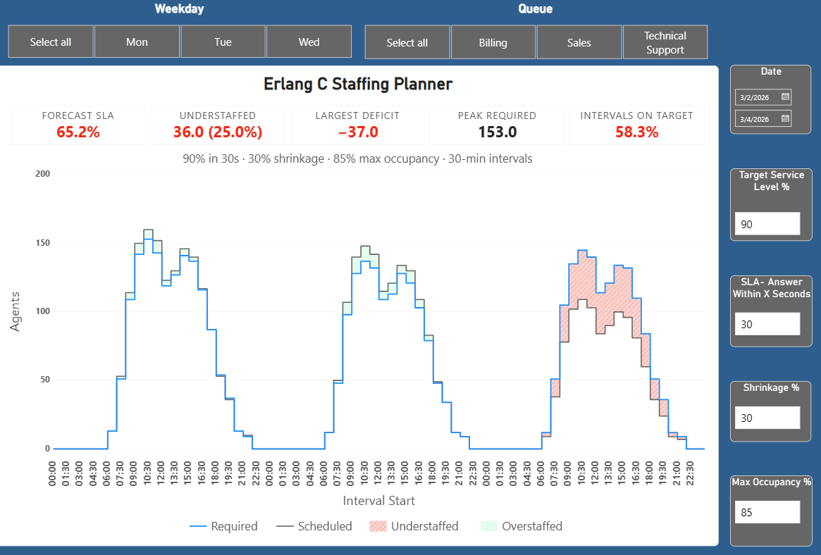
Four parameters is a lot of slicers. An arrangement that keeps them out of the way:
- Across the top — a date range slicer, and day-of-week buttons for quick filtering
- The visual taking the bulk of the canvas
- Down the right edge — the four parameters as compact single-value cards, stacked
That keeps every assumption visible and adjustable without crowding the chart, and it is the layout the sample report uses.
The four override wells
| Field well | Overrides | Suggested range |
|---|---|---|
| Target service level % | The share half of your SLA | 50 to 99 |
| Answer within (seconds) | The seconds half | 10 to 120 |
| Shrinkage % | Shrinkage | 0 to 60 |
| Maximum occupancy % | The occupancy ceiling | 60 to 95 |
Whatever you do not map keeps its Format-pane value, so you can expose just shrinkage and leave the rest fixed.
Use whole numbers, not decimals
These take 80, not 0.8. Build your parameter over 0 to 100, not 0
to 1. The Suggested range column above is about what values are sensible
to expose to a reader, not what the field accepts — the field accepts whole
numbers, and a narrower slider is a courtesy, not a requirement.
A parameter built over 0–1 is the easy mistake and would otherwise compute staffing for a 0.8% service-level target quite happily. The visual catches it and tells you to multiply by 100 rather than calculating with it. Zero is allowed — 0% shrinkage is a real setting.
There is no override for interval length
Interval length describes your data rather than your assumptions, so it stays in the Format pane where you set it once. Readers can change the four settings above; they cannot change what an interval is.
Reading the chart
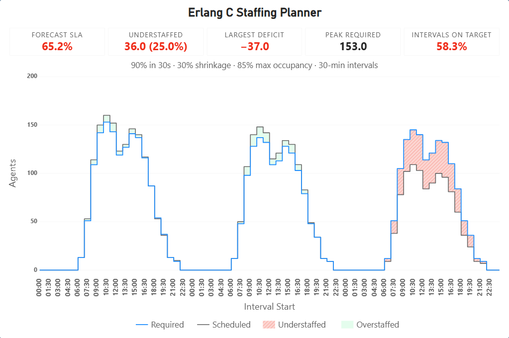
| Mark | Means |
|---|---|
| Solid line | Required scheduled agents — the answer, after shrinkage |
| Dashed line | Scheduled agents — what you have rostered |
| Shaded band | The gap. Red and hatched when short, green when surplus |
| Faint dotted line | Required productive agents, before shrinkage. Off by default |
Shortfalls are hatched as well as coloured, so they survive being printed in black and white, projected badly, or read by someone with colour-vision deficiency. If you export the report, the understaffed intervals still stand out.
The summary metrics
| Metric | Means |
|---|---|
| Forecast SLA | The service level your roster is expected to deliver overall. Red when below target |
| Understaffed | Intervals where scheduled staffing is below requirement |
| Largest deficit | The worst single-interval shortfall |
| Peak required | The highest scheduled requirement in range |
| Intervals on target | The share of intervals that individually clear the target |
Forecast SLA and Intervals on target answer different questions. One says what service level the day will deliver; the other says how many intervals clear the bar. A day can have two thirds of its intervals on target and still miss badly overall, if the misses land where the volume is.
Forecast SLA is weighted by contacts, because service level is a ratio of contacts answered in time to contacts offered. A quiet overnight interval sitting at 100% does not get to cancel out a morning peak sitting at 40%.
The assumptions line
Under the metrics, the parameters that produced the numbers:
80% in 20s · 30% shrinkage · 85% max occupancy · 30-min intervals
It follows whatever actually drove the calculation, so a reader moving a what-if slicer watches the assumptions move with it. A staffing number is not a fact on its own — it is a fact given those parameters.
Tooltips
Hover any interval for the full calculation: contacts, handle time, offered load in Erlangs, required productive agents, required scheduled agents, scheduled agents, the gap, expected service level and occupancy.
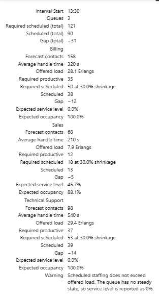
Every figure that went into the answer is there, so you can reconcile any interval against a spreadsheet by hand — useful when someone questions a staffing number.
Checking the maths yourself
Pick your busiest interval and work it through:
- Read contacts and weighted AHT from the tooltip.
- Offered load =
contacts × AHT ÷ interval seconds. For 300 contacts at 280 seconds in a 30-minute interval:300 × 280 ÷ 1800 = 46.7Erlangs. - Required productive agents will be somewhat above that — typically 10 to 20 percent higher at an 80/20 target.
- Required scheduled = that divided by
1 − shrinkage.
If required staffing comes out at three times offered load, or below it, the AHT measure is the first thing to check.
Working with queues
Mapping a queue field calculates each queue separately and adds the resulting agent counts together.
This is the no-pooling assumption: each queue is staffed by its own people. It matches how most contact centres actually schedule, and it errs towards more staff rather than fewer.
If your agents genuinely handle all queues from one pool, do not map the queue field. Pooling more traffic into one queue needs fewer total agents, so calculating them separately will overstate what you need.
Service level and occupancy are shown per queue rather than combined. A single service-level figure across three separately staffed queues would be misleading, so hover a multi-queue interval and the tooltip breaks it down queue by queue.
Formatting
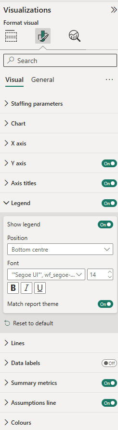
Every text element takes font, size, bold, italic, underline, alignment and colour: X axis, Y axis, axis titles, legend, data labels, summary metrics and the assumptions line.
Colour has a Match report theme switch, on by default, so text follows your report’s own colour and stays readable on a dark theme. Turn it off to choose your own.
Other cards:
- X axis — label format (seven presets plus custom patterns) and rotation. Rotating fits far more labels before the axis starts dropping them.
- Y axis, Data labels, Summary metrics — display units and decimal places.
- Lines — solid, dashed or dotted, and width, for each series.
- Colours — required, scheduled, understaffed, surplus.
Custom date formats
Under X axis → Label format → Custom:
Doubled tokens pad with a leading zero; single ones do not. Shown for Monday 2 March 2026, 09:05:
| Token | Gives | Token | Gives |
|---|---|---|---|
yyyy yy |
2026, 26 | HH H |
09, 9 |
MMMM MMM |
March, Mar | hh h |
09, 9 |
MM M |
03, 3 | mm m |
05, 5 |
dddd ddd |
Monday, Mon | ss s |
00, 0 |
dd d |
02, 2 | tt |
AM |
Put literal text in single quotes. HH'h'mm gives 14h30; without quotes
the h is read as a token. '' is an apostrophe.
Troubleshooting
Required staffing looks far too high. Almost always the AHT measure. Put it in a card and check it reads as a plausible handle time. See step 3.
Only a handful of points on the chart, one per day. The interval field is bound to the Date Hierarchy. Use the field chip dropdown to pick the plain field.
Staffing changes when I switch interval length, but the data did not. Correct — that setting tells the visual how long each interval is. Set it to match your data’s grain.
Scheduled staffing doubles when I change interval length. Your scheduled measure is summing rather than levelling. Scheduled agents is a headcount at a moment, not a quantity that accumulates.
“This field takes whole-number percentages.” A what-if parameter is returning a decimal. Build it over 0–100, not 0–1.
A gap in the scheduled line. Those intervals have no roster value. A blank is treated as unknown, not as zero agents, so the line breaks rather than dropping to the floor.
“Queue grouping requires a licence.” Splitting by queue needs a licence. Without one, remove the queue field — the visual then treats your traffic as a single pooled queue, which asks for fewer agents than staffing the queues separately would. Or assign yourself a licence in the Microsoft 365 admin centre.
What this visual does not do
This release sizes staffing for a forecast you already have. It does not:
- Generate schedules or shifts
- Optimise breaks or lunches
- Handle multi-skill or skill-based routing
- Model abandonment (Erlang A), retrials or callbacks
- Produce the forecast itself — you supply that
- Write anything back to your data
Erlang C assumes Poisson arrivals, exponentially distributed handle times, no abandonment, and infinite queue patience. Real queues abandon, which makes Erlang C generally conservative — it tends to recommend slightly more staff than a model with abandonment would. That is usually the safer direction for a staffing plan, but it is worth knowing.
Privacy
All calculations run inside Power BI on your machine. The visual makes no network requests, requests no web-access permissions, and sends no data anywhere. Your contact volumes never leave your tenant.